At first glance it may seem strange to identify the sensation of temperature with the visual perception of color. However, the experiments showed a difference of 3-4 degrees in the subjective sensation of heat or cold in the workshops painted in blue-green, and the workshops painted in red-orange. In the blue-green room, workers complained about the cold at 15 ° C, while in the red-orange room they began to complain about the cold only at 11-12 ° C. Scientific studies have shown that the blue-green color lowers the blood circulation impulse, while red-orange stimulates it. Similar results were obtained in experiments with animals. The horse stable was divided into two parts, one of which was painted blue and the other in red-orange. In the blue compartment, the horses quickly calmed down after the races, and in the red, on the contrary, they came to their senses for a long time and did not cool down. In addition, there were no flies in the blue compartment, while there were a lot of them in the red. Both experiments show the special significance of the contrast of warm and cold for color solutions. In hospitals where color therapy is applied, the properties of cold and warm colors play a very important role.
Returning to the color circle, we see that the yellow color is the lightest, and the violet is the darkest. This means that these two colors form the strongest contrast of light and darkness. At the right angle to the axis "yellow - violet" are located "red-orange" and "blue-green", which are the two poles of the contrast of cold and heat. Red-orange, or minium is the warmest, and blue-green, or manganese oxide is the coldest color. Usually yellow, yellow-orange, orange, red-orange, red and red-violet are usually called warm colors, and yellow-green, green, blue-green, blue, blue-violet and violet are cold, but such a classification can easily enter deceive us. In exactly the same way as the polarities of white and black are the lightest and darkest colors, and all gray tones are only relatively light or dark depending on whether they contrast with darker or lighter tones, so are blue-green and red-orange how the polarities of cold and heat are always cold and warm, while the intermediate colors between them can be cold or warm only depending on whether they contrast with warmer or colder colors. The nature of cold and warm colors could be represented in the following comparisons:
These various ways of displaying the contrast of cold and heat speak of its enormous expressive possibilities, which make it possible to achieve great beauty and special musicality of the general atmosphere of the work.
In nature, more distant objects, due to the air layer separating them from us, always seem to be colder. The contrast of cold and warm has the property to influence the feeling of proximity and distance of the image. And this quality makes it the most important graphic tool in the transfer of perspective and plastic sensations.
If it is necessary to create a composition worked out and strictly sustained from the point of view of a certain contrast, then all other contrasting manifestations should become secondary or not used at all.

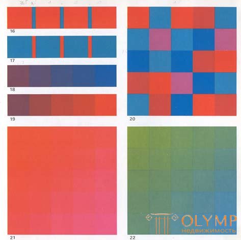
The contrast of cold and warm in its polar contrast of red-orange to blue-green is shown in Figure 16, and Figure 17 shows the same contrast, but with a changed area occupied by each color. In figures 18 and 19, the same purple color, being on the upper figure surrounded by cold neighbors, has a warm shade, and surrounded by warm ones on the lower figure - cold.
Figure 21 shows the transitions of red-orange color from cold to warm, and figure 22 shows the same changes, but within blue-green.
In exercises with the contrast of cold and warm, the contrast of light and dark is completely excluded, and all colors included in the composition should be equally light or equally dark.
These modulations can be performed at any tonal level, but the most favorable condition is the average lightness of the tones.
Changes in color characteristics should not go beyond the four adjacent colors of the twelve-part color wheel.
Exercise with a red-orange color can also be applied to orange, yellow-orange, red and red-purple. Exercise with blue-green color can be applied to green, yellow-green, blue and blue-violet.
If we want to achieve a polar contrast between cold and warm in their highest manifestation, then we need to build a chromatic scale from blue-green through blue, blue-violet, red-violet, red to red-orange. This scale, of course, may consist of a greater or lesser number of tonal steps. A chromatic series of cold-warm colors from yellow to red-orange can be suitable only if all colors are equal to the lightness of yellow, otherwise you have to deal with the contrast of light and dark.
These modulations achieve perfect beauty only in the absence of differences in lightness and darkness of the colors used.
While figures 21 and 22 give chromatic modulations of cold and warm colors, the composition of figure 20 shows how, by contrasting the matching of colors, it is possible to achieve their maximum sound.
The contrast of cold and warm can be considered the most “sounding” among other color contrasts. Thanks to him, it is possible to convey the highest music of the heavenly spheres with the help of color. Grunewald used this contrast to create the color base of the “Choir of the Angels”, and in the color decision of the other two scenes of the Isenheim altar with the image of angels surrounding God the Father in heaven, in composition with Mary, and in the scene of Christ's Resurrection. Grunewald turned to this contrast when he wanted to convey the feeling of a divine principle.
Abbot Shuger, sanctifying the first stained glass window of the church of San Denis in Paris, addressed the flock with the words that "... the material meaning of a person’s purpose is to comprehend the higher intangible essence of matter." And the sparkling hieroglyphs of the stained glass windows were meant to understand this. Their magical glow was so full of mystery that the believers directly sensed the penetration of the otherworldly through the glittering stained-glass windows. And the perception of stained glass windows caused in them a feeling of involvement in higher spirituality.
The stained glass windows of Chartres Cathedral, based on the symbolic combination of warm red and cold blue, breathe along with the rhythm of the sun's breathing. Due to the mobility of lighting, constantly changing with the sky light and the angle of the sun's rays, the color of the stained glass window during the day is always different. And thanks to this, the transparent matter of glass acquires the power of the shining of precious stones.
When Monet moved to landscape painting, he stopped writing his paintings in the studio and devoted himself to the open-air. He intensively began to study the dependence of the state of the landscape on the changing color relationships in different seasons, days and weather. He sought to capture in his paintings the flickering of light in the air and the fumes of hot earth, the light refraction of light in the clouds and in the rising mist, multiple reflexes coming from the calm surface of water and waves, the play of light and shadow in the trees. He observed that the local colors of objects, depending on their illumination or immersion in the shadow and on the color rays reflecting from all sides, acquire blotchiness, which is based primarily on the variation of warm and cool colors, rather than just light and dark. In Monet's landscapes, finally, the traditional for painting use of only the contrast of light and dark was overcome; henceforth, the contrast between warm and cold is now taking its place.
The Impressionists discovered that the cool blue color of the sky and air constantly contrasts with the warm hues of sunlight, playing the role of shadow colors. The charm of the paintings of Monet, Pissarro and Renoir is often precisely in the extraordinary game of modulations of cold and warm colors.
Examples of using cold and warm contrast are the stained glass windows of Chartres Cathedral (XII century); "Choir of angels" in the Isenheim Altar of Matthias Grünewald (1475-1528), Colmar, Unterlinden Museum; "Moulin de la Galette" by Auguste Renoir (1841-1919), Paris, Orsay Museum; The London Parliament in the Fog by Claude Monet (1840–1926), Paris, Orsay Museum; "Apples and Oranges" by Paul Cezanne (1839-1906), Paris, Orsay Museum.
Что бы оставить комментарий войдите
Комментарии (0)