Speaking of "color quality", we mean its purity and saturation. The words “contrast in saturation” fix the opposite between the colors saturated, pure and faded, muted. The spectral colors obtained by refraction of white light are the colors of maximum saturation or maximum purity.
Among the pigment colors, we also have the colors of maximum saturation. In this regard, we advise to pay attention to Figure 15, which reveals the degree of lightness and darkness of the primary colors in relation to each other. As soon as pure colors darken or lighten, they lose their saturation.
Colors can lose their purity in four ways, and they react very differently to the means that are used for these purposes.
Pure color can be mixed with white, which gives it a slightly colder character. The carmine-red color, when mixed with white, takes on a bluish tint and dramatically changes its character. Yellow is also getting a little colder due to the white impurity, and the basic character of blue remains largely unchanged. The violet color is extremely sensitive to the impurity of white, and if the rich dark purple color has something threatening in itself, then from the impurity of white it becomes brighter - purple - and makes a pleasant and quiet impression.
Pure color can be mixed with black. At the same time, yellow loses its radiant lightness and acquires a certain soreness and insidious poisonousness. This immediately affects its cleanliness. The picture of Géricault "Insane," written in black and yellow, makes a stunning impression of mental disorder. Black color enhances the inherent purple gloom, gives it a kind of limp and leads into darkness. When you mix black in a bright red carmine, the latter gets a sound that brings it closer to purple. Red cinnabar with the addition of black gives something like a burnt, red-brown substance. The blue color is eclipsed by black. A small addition of black is enough for its purity to quickly disappear. Green color allows for much more modulations than violet or blue, and has many possibilities for changing. Usually black takes flowers from flowers. He removes them from the light and more or less quickly "kills."
Saturated color can be weakened by adding to it a mixture of black and white, that is, gray. As soon as gray is added to the saturated color, then lighter or darker ones are obtained, but, in any case, shades fading than the original color. Adding gray neutralizes other colors and makes them "blind." Delacroix hated the gray color in the painting and, if possible, avoided it, because colors blended with gray are neutralized by simultaneous contrast.
Pure colors can be changed by adding appropriate additional colors. If yellow is mixed with the purple color, then intermediate tones between light yellow and dark purple will be obtained. Green and red are not very different in lightness and, when mixed, turn into gray-black. Different blends of two complementary colors when brightened with white color give rare shades of their complexity.
If all three colors of the “first order” participate in any mixture, then the resulting color will have a weak, faded character. Depending on the proportions, it may appear yellowish, reddish, bluish-gray or black. With the help of three colors of the “first order”, all degrees of fading can be obtained. The same applies to the three colors of the "second order" or to any other combination, if only three primary colors are involved in this mixture - yellow, red and blue.
The contrast effect “faded - saturated” is relative. Some color may appear saturated next to a faded color, and faded next to a more saturated one.
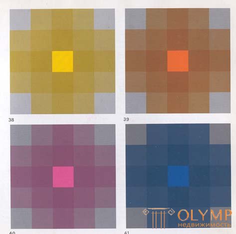
Basic exercises in saturation contrast can be conducted on a sheet, lined up like a chessboard twenty-five squares. Pure color is placed in the center, and neutral gray close in lightness at each of the four corners. Then gradually mixing the gray color with the pure one, we get various intermediate shades.
To identify the saturation contrast, it is necessary, avoiding the contrast of light and dark, to achieve a uniform change in the saturation of all squares.

Figures 38-41 give us an idea of the subtlest possibilities of contrast in saturation in chromatic modulations. Such exercises can also be performed on the basis of placing instead of gray in the corner squares of colors that complement the color of the central square. In this case, everything will be much more colorful than in the exercise with gray.
If we want to achieve expressiveness of the whole composition using only the saturation contrast without any other contrasts, then faded colors should be made on a saturated color base, that is, pure red should contrast with faded red, and pure blue should have faded blue. But you can not use pure red next to faded blue or pure green with faded red. Otherwise, the saturation contrast will be drowned out by other contrasts, for example, the contrast of cold and warm, and its action with quiet and calm expressiveness will be called into question.
Faded colors — mostly gray — appear alive thanks to the pure colors surrounding them. This can be observed if on one part of the “chessboard” in each second square to place a neutral gray color, and in the intermediate squares to place pure, saturated colors of the same lightness as gray. Then we will see that the gray color will acquire some vividness, while the chromatic colors next to it will appear less saturated and relatively weakened.
The use of saturation contrast can be seen in Georges de la Tour's Newborn paintings, Rennes City Museum; Henri Matisse (1869-1954) "Peon", New York, Museum of Modern Art and Paul Klee (1879-1940) "Magic Fish", Philadelphia, Museum of Art.
Что бы оставить комментарий войдите
Комментарии (0)