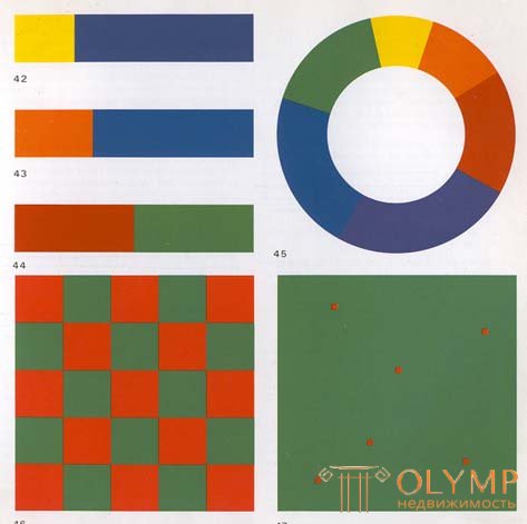
Contrast on the area of color spots characterizes the size relationships between two or several color spots. Its essence is the opposition between “many” and “little”, “big” and “small”.
Colors can be stacked with one another in spots of any size. But we would like to find out which quantitative or spatial relations between two or several colors can be considered balanced and under what conditions none of them will stand out more than the other. The impact of color is determined by two factors. First, the lightness of the color and, secondly, the size of the color spot. In order to determine the lightness of those or other colors, it is necessary to compare them with each other on a neutral gray background. At the same time, we make sure that the intensity of the action or the degree of lightness of individual colors are different.
Goethe established simple numerical relations, which are very convenient in our case. These ratios are approximate, but who will demand exact data if commercially available paints produced in different factories and sold under the same name differ so much from each other? Ultimately, the eye must decide. In addition, the color patches in a picture are often fragmented and complex in shape, and it would be very difficult to bring them to simple numerical relationships. The eye deserves more confidence, but provided that it has a developed sensitivity to color.
According to Goethe, the degree of lightness of the primary colors can be represented by a system of the following relations:
| yellow: | 9 |
| Orange: | eight |
| red: | 6 |
| Violet: | 3 |
| blue: | four |
| green: | 6 |
Here are the lightness ratios of the following pairs of additional colors:
If to harmonize the sizes of color spots rely on these data, it is necessary to use equivalents inverse to the ratio of light values. That is, yellow, being three times lighter, should occupy only one third of the space occupied by the additional purple color.

As shown in Figure 42-44, the following proportions are characteristic of harmonious proportions of spots filled with additional colors:
Thus, the harmonious dimensions of the planes for primary and secondary colors can be expressed by the following numerical ratios:
| yellow: | 3 |
| Orange: | four |
| red: | 6 |
| Violet: | 9 |
| blue: | eight |
| green: | 6 |
Or:
All other colors can be represented accordingly in a proportionate relationship with each other.
Figure 45 shows the range of harmonious relationships of primary and secondary colors in their spatial characteristics. It is built as follows:
First, the whole circle is divided into three equal parts, then each of them, in turn, is divided in proportion to the numerical ratios of the two additional colors:
When these proportions are found, another circle of the same size is drawn, where, according to the proportions found, a color row is created according to the sequence of the color wheel: yellow, orange, red, purple, blue and green.
Color spots harmonized in their size give the impression of calm and stability. The contrast over the area of color spots in this case is neutralized due to harmoniously composed color spots.
The system of quantitative ratios presented here is valid only when colors are used in their maximum saturation. When it changes, the corresponding sizes of color spots change. Both factors - the saturation and the size of the color spot are very closely related.
In Figure 46, red and green are given in equal spatial proportions. Red and green as complementary colors, having equal spaces of their color field, create a feeling of stable, lasting harmony. But in the case when these spatial relationships are violated, irrational anxiety arises.
If in the color composition instead of harmonious spatial relations between the colors any one color dominates, the composition acquires a particularly expressive activity. The concreteness of the chosen ratios is determined by the goal and depends on the theme of the painting, artistic sense and taste of the artist.
With a pronounced contrast of colors over the area, they begin to make a completely new impression.
In Figure 47, the red color is shown in an extremely minimal amount. Green in relation to it occupies a huge area, in connection with which, by the law of simultaneous contrast, red, on the contrary, begins to sound stronger.
In the section on simultaneous contrast, it was found that the eye requires an addition to each given color. To date, the cause of this phenomenon has not been elucidated. In all likelihood, we are subject to some kind of universal desire for balance and self-defense. This same desire is due to its special effect and the contrast over the area of color spots. Caught in a smaller amount and occupying a smaller area, caught, so to speak, “in trouble”, the color reacts, defends itself and makes a relatively stronger impression than if it were used in harmonized proportions, as in Figure 46. This fact is known as a biologist and gardener. When a plant, an animal or a person falls into a miserable situation as a result of harsh living conditions, then in the same plants, animals and people, resistance forces wake up, which, under a happy set of circumstances, allow to achieve great results. If during long-term contemplation of the picture to focus on any color that occupies a small area, then this color begins to seem more and more intense and acts excitingly.
Thanks to the use of two mutually reinforcing contrasts, the picture can be given an extraordinary vividness and the rarest color expression. Here an exceptional feature of contrast in the area of color spots is manifested - its ability to change and enhance the manifestation of all other contrasts. In the section on the contrast of light and dark, a little has been said about color proportioning. But in essence, it is only the area contrast that in the full sense is the contrast of proportions. If in a composition based on the contrast of light and dark, a large dark part contrasts with a less light one, then thanks to this opposition, the work can acquire a particularly deeper meaning. For example, in Rembrandt’s The Man with the Golden Helmet, a contrasting comparison of a very small bright spot on his shoulder with the total volume of a man’s head involuntarily makes him feel a sense of particular significance of the image. In the works of Mondrian, the composite structures of red, yellow and blue stripes hold the overall dimensions of the canvases. And in Bruegel in his picture “Icarus Fall”, a contrasting comparison of the blue-green-brown color of the landscape and the small red-orange spots of the sleeve and the plowman’s collar injected into it plays a different role, ensuring the graphic integrity of the picture. Coordination of the sizes of color spots is at least as important in the work on a pictorial work as the choice of color scale itself, since each color composition must proceed and develop from the ratios of color spots.
The shapes, sizes and outlines of color spots should be determined by the nature of the color and its intensity, and not be predetermined by the actual pattern.
Compliance with this rule is especially important for determining color masses. The size of the color spots in no case can not be set using linear contours, because these dimensions are determined only by the intensity of colors, the nature of color, its lightness and force of influence, which largely depends on the contrast matching of colors. If the yellow spot should stand out among the light tones, then it should occupy a much larger area than in the case when the same spot is surrounded by dark tones. There is a fairly small yellow spot, because its lightness is enhanced by the environment itself.
Similarly, the relationship of all color masses should be aligned in accordance with the strength of their impact.
Что бы оставить комментарий войдите
Комментарии (0)