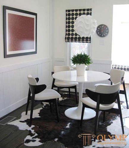
Pop art ( English pop-art, short for popular art - a stactile blow, cotton ) is a trend in the fine arts of the 1950s-1960s, which arose as a reaction to abstract expressionism using images of consumer products.
Pop art was created to amaze people with its design. In interior design, pop art looks unusual, expressive, contrasting, bright. The main features of pop art: rainbow colors, eye-catching shapes, the use of plastic, repeating elements.
Pop art openly challenged the principles of “good design”, denied modernity and its values. Pop art elevated to the rank of a work of art ordinary household items from the everyday world around us and images of people. Then he mixed all this with a bright color or a bizarre form and used as a work of art. Pop art shows itself as an emotional and energetic style, like an explosion of emotions.
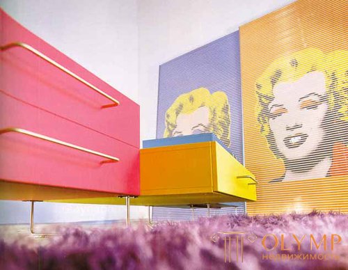
Pop Art Style in the interior, photo
The main elements of Pop Art style:
The term "pop art" first appeared in the press in an article by the English critic Lawrence Alloway (1926-1990). In 1966, Elloway openly admitted: “Then I did not put into this notion the meaning that it contains today. I used this word along with the term “pop culture” to characterize media products, rather than works of art for which elements of this “folk culture” were used. In any case, the concept came into use somewhere between the winter of 1954/55 and 1957. " The first "partavskie" work created three artists who studied at the Royal Art College in London - Peter Black, Joe Tilson and Richard Smith. But the first work that received the status of an icon of pop art was Richard Hamilton's collage "What makes our houses so different, so attractive?".
The pop art style originated in the mid-1950s in England as a reaction to abstract painting, which supporters of pop art considered too complex and elite, but it reached its heyday in the 1960s in the USA. The main focus was on change, diversity, fun, rebellion and short-lived, disposable things, cheapness and a bet on mass consumption.
Designers are engaged in the production of things that the consumer wanted, and not those in which he needed. Mass media and advertising were the main themes of pop art, wittily glorifying “consumer society”. The objects of pop art have become images of mass culture, reflecting the spirit of the era.
The most famous works of pop-art style: collages of Robert Rauschenberg - a combination of oil paint and clippings from newspapers and advertising publications; large comic pictures of Roy Lichtenstein; Klas Oldenburg's giant cakes of colored plaster, as well as car-sized pieces and hamburgers the size of a car stitched from canvas and plush, as well as the work of Jasper Johns, James Rosenquist and of course Andy Warhol.
T-shirts with images of comics, celebrities and household items - all this is the legacy of pop art of the 60s. Later, pure pop art closely intertwined with the advertising business and died out, becoming part of popular culture, but its echoes are felt today.
Pop design was inseparably connected with the American dream of an absolutely consumer worldview, which in the early 60s took possession of the entire Western world. The idea of producing durable, high-quality goods was replaced by the slogan "today used - threw it away tomorrow." It was a breakthrough in the philosophy of industrial production and design. The children's chair made of corrugated cardboard by Peter Murdock, the pneumatic chair made of polyvinyl chloride Di Paz, D Urbino, P. Lomazi became symbols of the spreading “culture of fragility”. Pop design with its bright colors, bold shapes, cheap goods has become a style for young people. The most popular materials for pop designers were various types of plastics, the manufacturing processes of which were already well mastered in the 60s. Plastic attracted low price and variety of colors. Enzo Marie was one of the first to experiment with plastic.
Pop art in the interior is an artificially made place, because the “laws” of the ceiling, the floor and the walls are not observed, they can smoothly run over each other, or their borders are occasionally “blurred” by fascinating visual solutions.
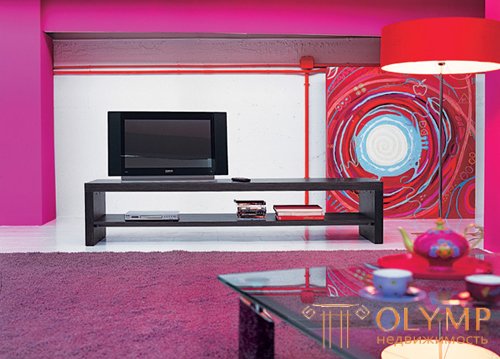
Style pop art in the interior, photo
For interior design in the style of pop art, it is desirable to have a spacious room. If the dimensions leave much to be desired, you can get away with the “light” option - focus on the details, stylize the interior to the desired image.
For pop art is characterized by the use of bright (up to acid) and saturated colors. As a rule, the main color of the interior is white, pastel colors close to white are allowed. In addition to it are color combinations of several bright colors. A characteristic feature - the colors rarely complement, smooth each other. More often they are contrasted and contrasted. However, do not abuse the riot of colors - you need to bear in mind that in this room you will have to live. Bright can look beautiful and fresh, but there is a danger that the owner will quickly get tired of the riot of colors.
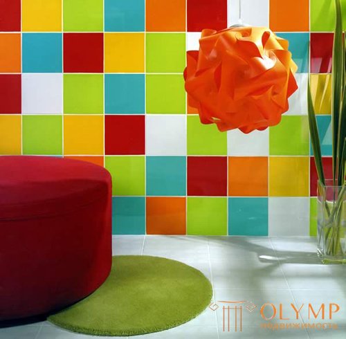
Style pop art in the interior, photo
The walls in the style of pop art must be bright, and ideally - in different colors and even texture. It is better to forget about harmony in the classical sense at once. One of the solutions is pop art, when one of the walls remains light, two more are of contrasting bright colors, and the fourth is made in the technique of repeatedly repeating small patterns.
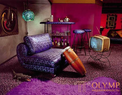
Pop Art Style in the interior, photo
The ceiling in the style of pop art. The number of ceiling levels does not matter, on the contrary, you can play on this by making multi-level asymmetrical niches, beating it with the backlight of different colors. In the case of a single-level ceiling, choose a glossy coating, be it suspended, stretch, or simply painted white ceiling. Glitter and gloss pop art to the face.
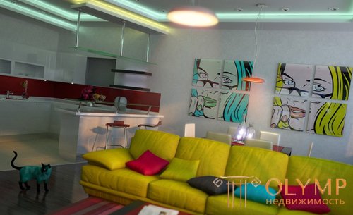
Pop Art Style in the interior, photo
Pop-art floors are often left neutral, choosing a calm range of parquet and throwing all the emphasis on the interior. However, they also often use flashy floor coverings: a carpet of saturated color or ceramics, making it patchy, but rather with a chaotic and playful pattern. Parquet should be abandoned.
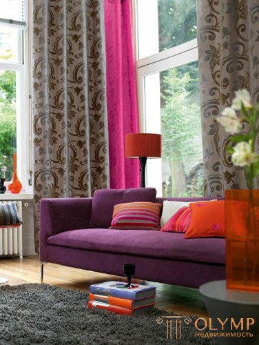
Pop Art Style in the interior, photo
Furniture in the style of pop art. Pop art is not acceptable oversaturation of furniture, so limit yourself to the minimum set. Furniture pop art should be extraordinary and certainly not classic. The forms are gentle, rounded, somewhat unusual - in the style of "retro-futurism". Often used in furniture female silhouette, cartoon characters and celebrities. The furniture is characterized by bright colors (one, and preferably somewhat in one subject), typical for 60s sofas and armchairs of rounded shapes, padded stools and small tables, bright plastic has become fashionable. Cabinets are not relevant in pop art, as this is the most significant element in cluttering up the interior space. It is better to replace them with niches, built-in wardrobes and even podiums. For clothes it is best to allocate a separate dressing room. An interesting point: the furniture can and should be applied ornaments, drawings from comics and even graffiti.
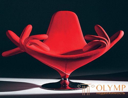
Pop Art Style in the interior, photo
Pop art indulges with an abundance of details and interesting details. The use of repetitive motifs is characteristic: posters, paintings, carpets with a replicated pattern. The bright and motley textiles which are picked up in the main color scale are welcomed. Various stylized plastic accessories: watches, photo frames, figurines, vases, lamps and candlesticks. In addition to plastic and textiles, you can still highlight painted leather and bright metal (chrome) parts in the interior. The most unusual objects are suitable for pop art: luminous dishes, pink toilet, lamp in the form of superman and other extraordinary things.
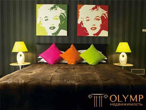
Pop Art Style in the interior, photo
Pop art in the interior is perfect for fans of "hand made" (made by hand). Any fancy thing made by your hands will be a work of art pop art. The main tools of pop art are games with size, color and quantity. Habitual and banal things are subjected to appropriate processing of pop art, which ultimately gives rise to new entities.
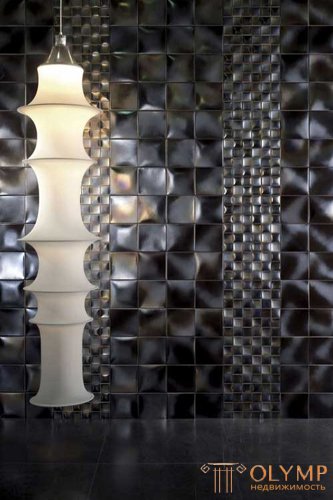
Pop Art Style in the interior, photo
The style of pop art is peculiar psychedelic effect. It can be achieved using wallpaper with the effect of optical illusion, disappearing and appearing pattern, as well as paintings and drawings. The main thing is not to lose in all this the overall comfort, above all, spiritual. Favorite techniques of artists and designers when working on the interior of pop art and furniture in the style of pop art are copying the object, changing its scale and proportions. The color scheme is different from the prototype of a real object, it is bright, juicy. A favorite technique is collage, stencil and copying.
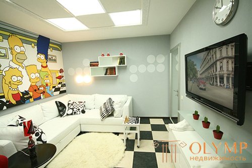
Pop Art Style in the interior, photo
Pop art may well be called an inexpensive style, in terms of price, and not the overall effect. This is the case when an inexpensive furniture purchased in a well-known hypermarket is suitable. It can be manually painted and decorated using the “what is enough imagination” method. Other items of pop art can be made from improvised means: from a bottle - a table lamp, from CD-disks a pseudo mirror, a curtain of pieces of cloth or polyethylene, a picture of labels, etc. things. With all this, the main thing is to catch the line between creative creativity and the dump of incomprehensible things.

Style pop art in the interior, photo
Pop art in interior design looks quite expressive and unusual. Moreover, you can think up your own interior design in the style of pop art, and no one dares to tell you that you have made a tasteless design. It is known that pop art is designed to shock.
Style Pop art in the interior is certainly not for everyone. The abundance of bright and caustic colors can tire the working class, which is more pleasant for relaxing in neutral or pastel colors. But lovers of shock to others, in particular young people, as well as for salons or stylized cafe style will have to be the way more than any other.
Pop art is a direction addressed to young people, because it focuses on flashy colors, bold combinations, non-standard, “crazy” solutions. This style is suitable for those who are ready to plunge into the “abyss” of popular art, throw away all conservative and traditional ideas and make their lives brilliant, catchy and devoid of peace.
Что бы оставить комментарий войдите
Комментарии (0)