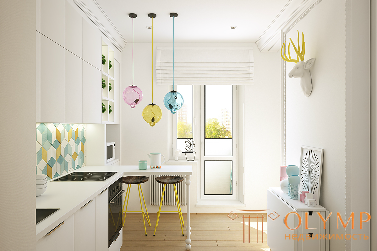
Interiors in bright colors or even completely white interiors - there is something that makes them pleasant to the eye, and for some reason they do not seem completely empty, like in a hospital. Let's see what exactly makes them interesting.
1. Competently designed and comfortable layout.
Oddly enough, this is the basis for the success of such an interior. The correct and ergonomic arrangement of furniture and walls makes the interior functional. And it is the functionality that gives life to the usual bright interior. To create a functional interior means to remove all unnecessary, leaving only the essence. When arranging furniture, do not forget about the comfortable distances between the objects - for the passage, for the space of action. A functional interior becomes when it is convenient to live and move around in it, it is convenient to cook, wash and everywhere there is free space for action.

2. Composition in the volume of light interior
The second component is the composition of bulk solutions. That is, how are the storage systems, what form the table, the volume of the chandelier. All this should be properly arranged in volume. Let's imagine for a second that there are no textures in the interior, no colors, we will remove all the finishing materials. The interior with a competent composition in volume will look great without color. How to achieve this? There are basics of composition and some rules by which you can build it. Interior designers are learning this. Therefore, the interiors of a competent designer with a well-designed composition will look good, even completely in white.
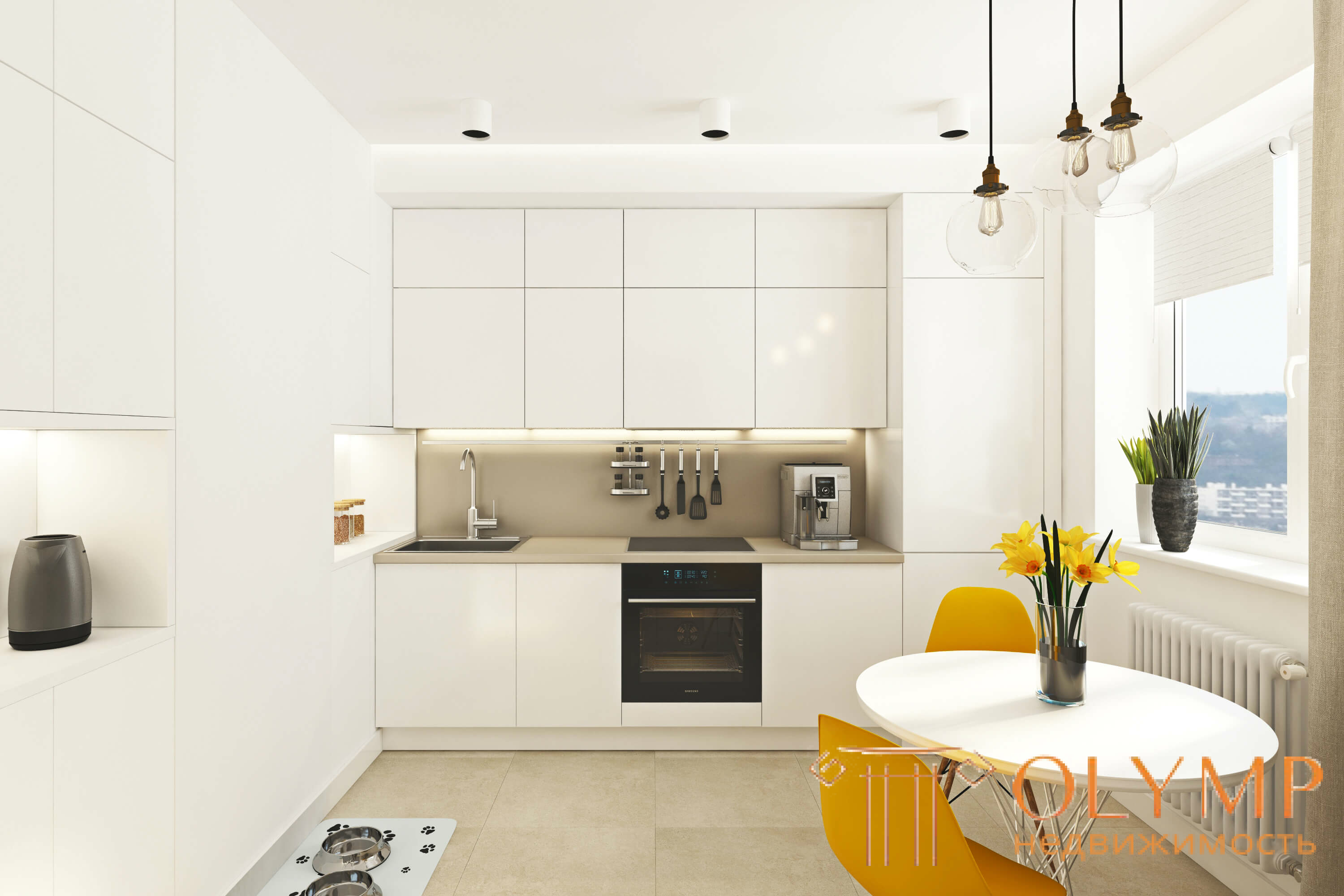
3. Selection of textures, materials
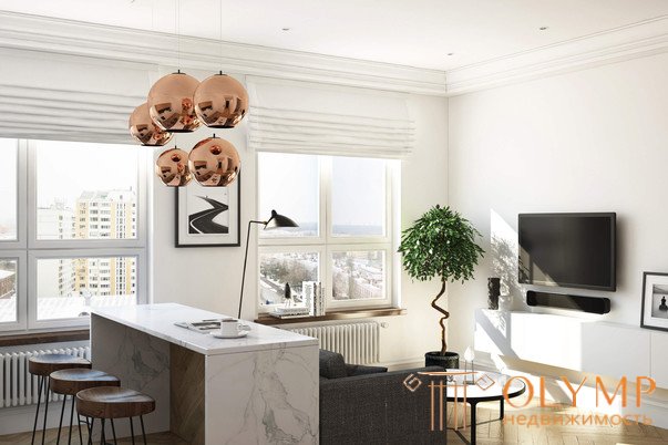
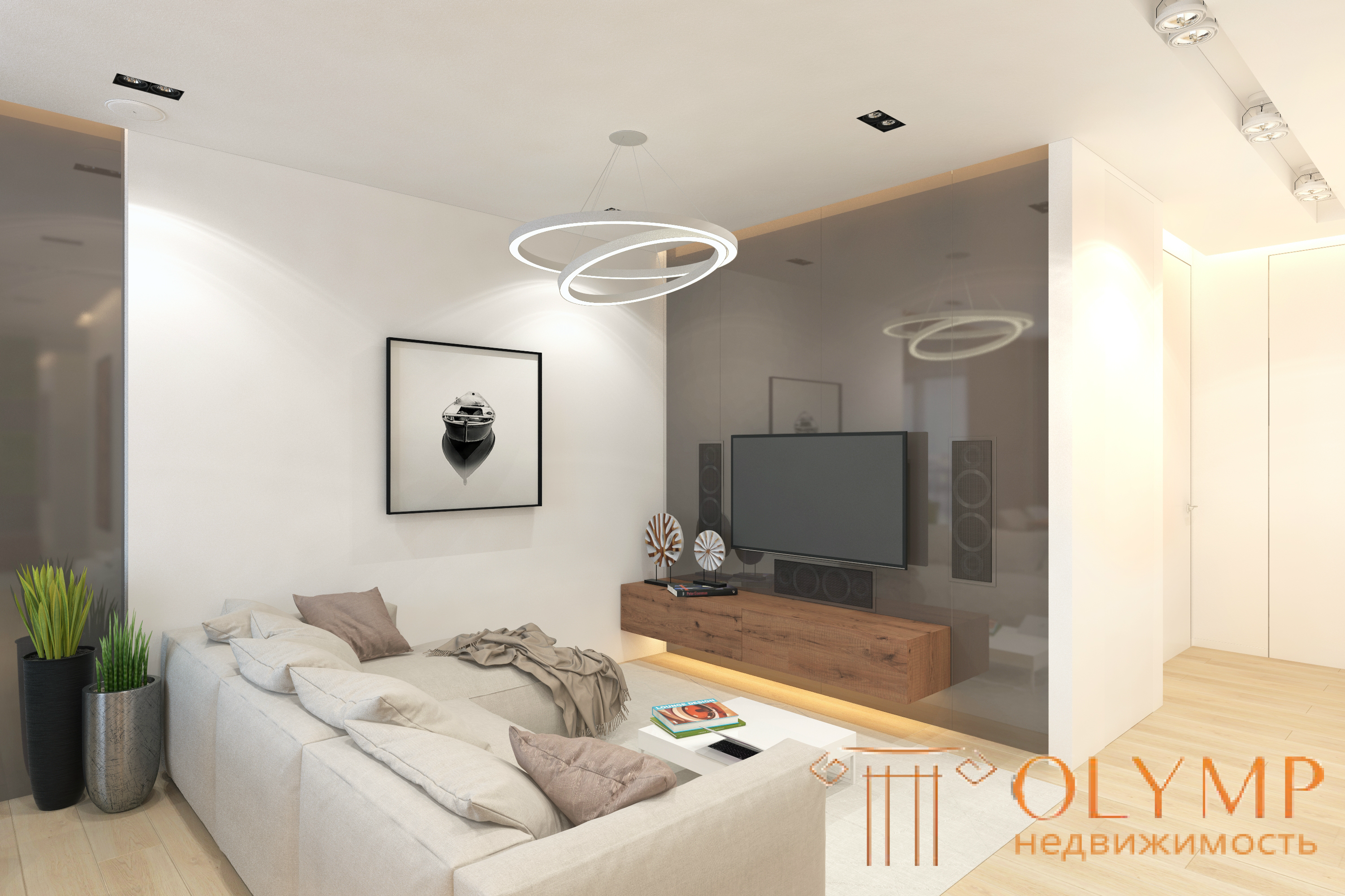
Making white interiors completely interesting is a very difficult task that not even every interior designer can handle. Still, we will consider ways easier. It is important to select several materials and distribute them throughout the interior so that the white color prevails and is the background. In this case, the remaining 2-3 materials can be a tone or two darker than white. The textures should be contrasting. What does it mean? The main point in the selection of textures and materials will be to make a contrasting combination. More specifically, if you add up 2-3 materials, they will stand out from each other, but they will not contrast much. The texture of materials may differ drastically. For example, white smooth walls, aged light oak with knots, gray-beige linen. All materials will be light, but their texture will vary greatly.
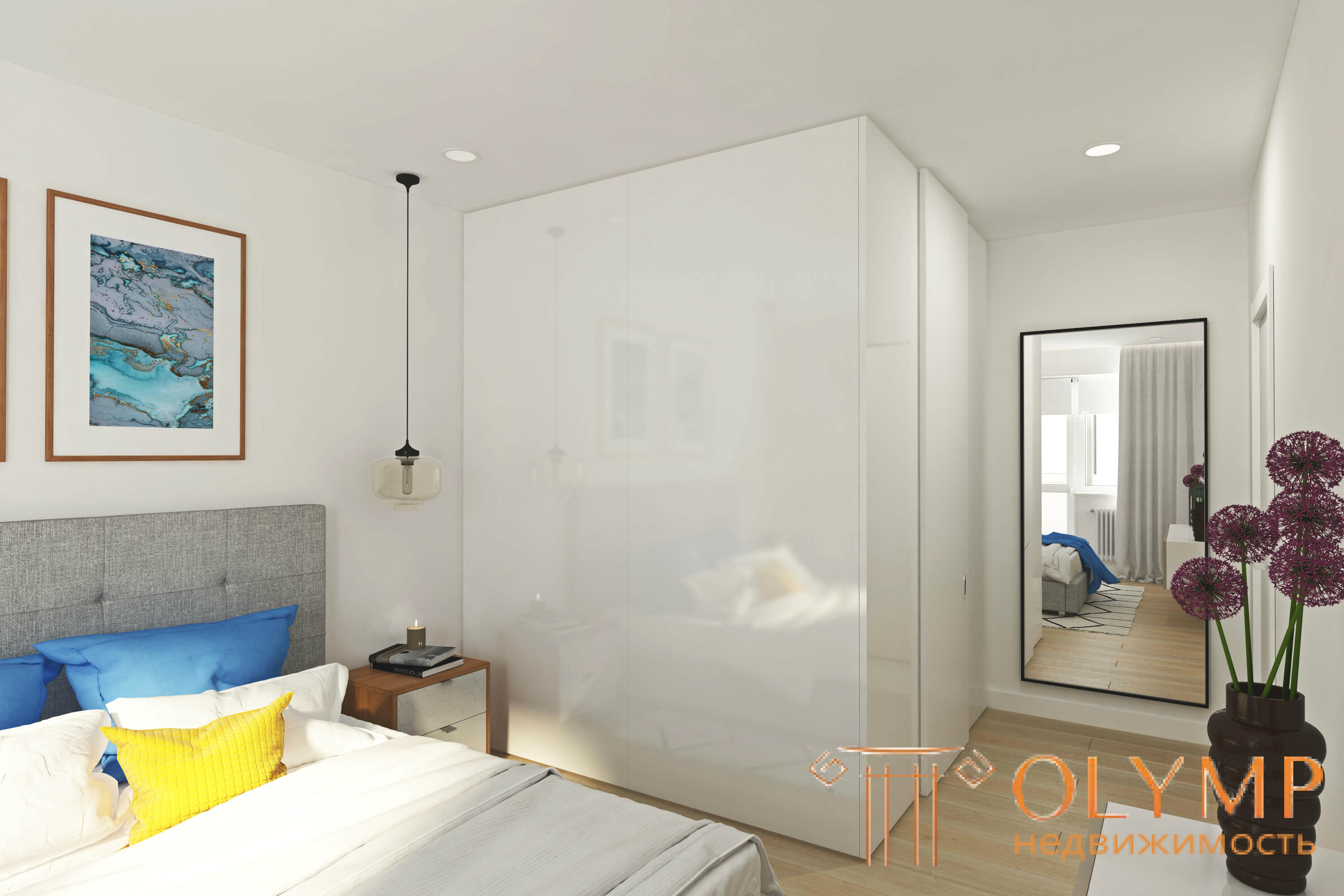
4. Dark elements locally
We got to the details, and here it is important to choose accents that will create dynamics in the interior, which will fill the space and give it a highlight. If the interior is too faded - you can choose a black or dark gray accent and repeat it in several places. This sets the rhythm in the interior, it becomes more interesting. For example, you can use a chandelier with a laconic black frame and put a dark gray pillow on the sofa. Support this idea can be thin legs made of ferrous metal in chairs. It is important not to overdo or overload the space with these black elements. There is a risk of getting too contrasting result, the eye will cling to all these elements and this can disturb the calmness of the interior.
5. Carefully selected decor
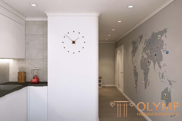
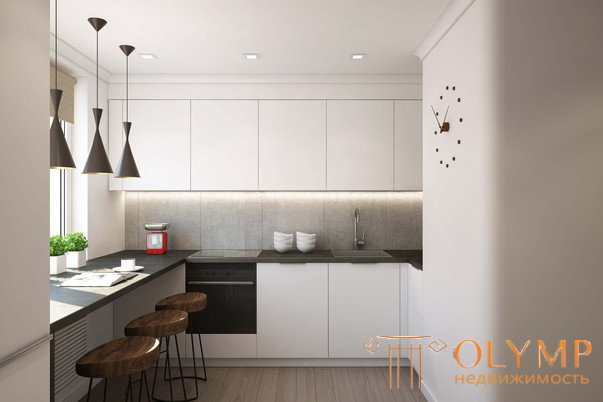
6. Contrast large elements
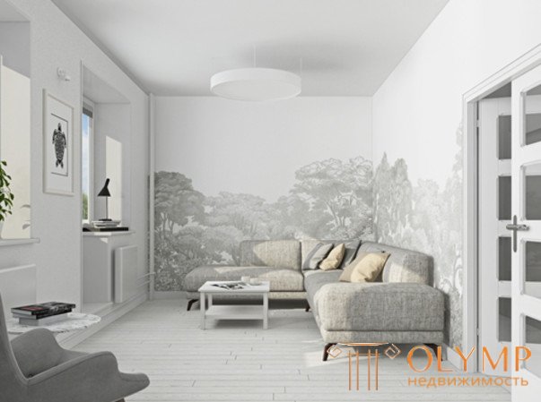
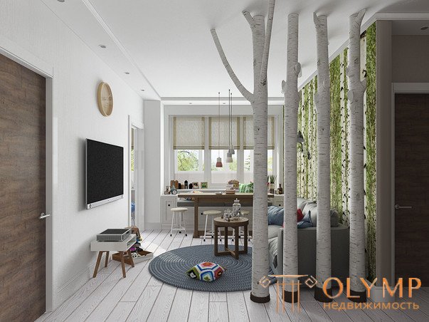
If it is difficult to create a composition with only light elements, you can always locally select one wall with color or texture, or select an entire object. Here you can experiment. For example, choose a vintage brick as an accent or texture for concrete. The main idea is to make a contrast accent. It is important not to overdo it and still leave the bright interior with a predominance of white color in the mass.

Что бы оставить комментарий войдите
Комментарии (0)