When people talk about color harmony, they appreciate the impressions of the interaction of two or more colors. Painting and observation of the subjective color preferences of various people speak of ambiguous ideas about harmony and disharmony.
For most, color combinations, commonly referred to as “harmonious,” usually consist of colors that are similar in nature or different colors that are close in lightness. Basically, these combinations do not have strong contrast. As a rule, the assessment of harmony or dissonance is caused by a pleasant-unpleasant or attractive-unattractive feeling. Such judgments are based on personal opinion and are not objective.
The concept of color harmony should be removed from the field of subjective feelings and transferred to the field of objective laws.
Harmony is an equilibrium, a symmetry of forces.
The study of the physiological side of color vision brings us closer to solving this problem. So, if you look at the green square for a while and then close your eyes, then a red square will appear in our eyes. Conversely, watching the red square, we get its “return” - green. These experiments can be performed with all colors, and they confirm that the color image that arises in the eyes is always based on the color, in addition to the actually seen. Eyes require or produce additional colors. And this is a natural need to achieve balance. This phenomenon can be called a consistent contrast.
Another experience is that we impose a smaller gray square in lightness on a colored square. On yellow, this gray square will appear light purple to us, on orange - bluish-gray, on red - greenish-gray, on green - reddish-gray, on blue - orange-gray and on purple - yellowish-gray (Fig. 31- 36). Each color makes gray take on its extra shade. Pure colors also tend to color other chromatic colors with their complementary colors. This phenomenon is called simultaneous contrast.
Consistent and simultaneous contrasts indicate that the eye receives satisfaction and a sense of balance only on the basis of the law on complementary colors. Consider it on the other side.
Physicist Rumford was the first to publish his hypothesis in 1797 in the Nicholson magazine that colors are harmonious if their mixture gives white. As a physicist, he proceeded from the study of spectral colors. In the section devoted to the physics of color, it was already said that if we remove any spectral color, suppose red, from the color spectrum, and the remaining colored light rays — yellow, orange, purple, blue and green — are assembled together with a lens, then the sum of these residual colors will be green, that is, we will get a color that is complementary to the one that was removed. According to the laws of physics, color mixed with its complementary color forms the total amount of all colors, that is, white, and the pigment mixture in this case will give a gray-black color.
The physiologist Ewald Goering has the following remark: “The average or neutral gray color corresponds to the state of the optical substance, in which dissimilation — the expenditure of forces expended on color perception, and assimilation — their recovery — are balanced. This means that medium gray creates a state of equilibrium in the eyes. ”
Goering proved that the eye and the brain require a medium gray, otherwise, in its absence, they lose calm. If we see a white square on a black background, and then look in the other direction, then in the form of a residual image we will see a black square. If we look at the black square on a white background, then the residual image will be white. We see in our eyes the desire to restore the state of equilibrium. But if we look at the medium-gray square on the medium-gray background, then in the eyes there will be no residual image that differs from the medium-gray color. This means that the medium gray color corresponds to the state of balance required by our vision.
The processes going on in visual perception cause the corresponding mental sensations. In this case, the harmony in our visual apparatus indicates a psychophysical state of equilibrium, in which the dissimilation and assimilation of the visual substance are the same. Neutral gray corresponds to this state. I can get the same gray color from black and white or from two complementary colors if they are composed of three primary colors — yellow, red, and blue in the proper proportion. In particular, each pair of complementary colors includes all three primary colors:
Thus, it can be said that if a group of two or more colors contains yellow, red and blue in appropriate proportions, then the mixture of these colors will be gray.
Yellow, red and blue represent the total color combination. For the satisfaction of the eye, this common color bundle is required, and only in this case the color perception reaches a harmonious equilibrium.
Two or more colors are harmonious if their mixture is a neutral gray.
All other color combinations that do not give us gray color, by their nature, become expressive or disharmonious. In painting there are many works with one-sided expressive intonation, and their color composition, from the point of view of the above, is not harmonious.
These works act annoyingly and too excitingly with their pointedly persistent use of a single predominant color. There is no need to argue that color compositions must necessarily be harmonious, and when Seurat says that art is harmony, he confuses artistic means and goals of art.
It is easy to see that not only the arrangement of colors relative to each other, but also their quantitative ratio, as well as the degree of their purity and lightness, are of great importance.

The basic principle of harmony comes from the law of complementary colors determined by the physiology. In his work on color, Goethe wrote about harmony and integrity as follows: “When an eye contemplates color, it immediately comes to an active state and, by its nature, inevitably and unconsciously immediately creates a different color, which, in conjunction with this color, contains the entire color circle . Each individual color due to the specifics of perception causes the eye to strive for universality. And then, in order to achieve this, the eye, for the purpose of self-gratification, searches beside each color for some colorlessly empty space into which it could produce the missing color. This is the main rule of color harmony. ”
Color harmony was also addressed by the color theorist Wilhelm Ostwald. In his book on the basics of color, he wrote: “Experience teaches that some combinations of some colors are pleasant, others are unpleasant or do not cause emotions. The question arises, what determines this impression? It can be answered that the colors between which there is a natural connection, that is, order, are pleasant. The combination of colors, the impression from which we are pleased, we call harmonious. So the basic law could be formulated as follows: Harmony = Order.
In order to determine all possible harmonious combinations, it is necessary to find a system of order that includes all their variants. The simpler this procedure, the more obvious or taken for granted will be harmony. We found two systems capable of providing this order: color circles connecting colors of equal degree of saturation — and triangles for colors representing mixtures of a particular color with white or black. Color circles make it possible to determine harmonious combinations of various colors, triangles - color-tone harmony. ”
When Ostwald asserts that “... colors that we like the impression of pleasant, we call harmonious,” he expresses his purely subjective view of harmony. But the concept of color harmony should be moved from the area of subjective attitude to the area of objective laws.
When Ostwald says: “Harmony = Order”, offering color circles for different colors of the same saturation and color-tonal triangles as an order system, he does not take into account the physiological laws of residual image and simultaneity.
An extremely important basis for any aesthetic theory of color is the color wheel, because it provides a color distribution system. Since the colorist artist works with color pigments, the color order of the circle must be built according to the laws of pigment color mixtures. This means that diametrically opposed colors should be complementary, that is, giving a gray color when mixed. So, in my color wheel, the blue color stands against orange, and the mixture of these colors gives us a gray color.
While in the Ostwald color circle, the blue color is opposite to yellow, and their pigment mixture gives green. This major difference in construction means that Ostwald’s color wheel cannot be used either in painting or in applied arts.
The definition of harmony lays the foundation for a harmonious color composition. For the latter, the quantitative ratio of colors is very important. Based on the lightness of the primary colors, Goethe derived the following formula for their quantitative ratio:
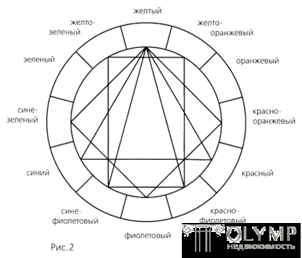
It is possible to make a general conclusion that all pairs of complementary colors, all combinations of three colors in the twelve-piece color wheel, which are connected to each other through equilateral or isosceles triangles, squares and rectangles, are harmonious.
The connection of all these figures in the twelve color circle is illustrated in Figure 2. The yellow-red-blue form here the main harmonic triad. If these colors in the twelve-color color wheel system are interconnected, we get an equilateral triangle. In this triad, each color is represented with extreme strength and intensity, each of which performs here in its typically generic qualities, that is, yellow acts on the viewer as yellow, red — as red, and blue — as blue. The eye does not require additional additional colors, and their mixture gives a dark black and gray color.
Yellow, red-violet and blue-violet colors are united by an isosceles triangle. The harmonious consonance of yellow, red-orange, purple and blue-green are united by a square. The rectangle gives a harmonized combination of yellow-orange, red-violet, blue-violet and yellow-green.
A bundle of geometric figures, consisting of an equilateral and isosceles triangle, square and rectangle, can be placed at any point of the color wheel. These figures can be rotated within a circle, thus replacing a triangle consisting of yellow, red and blue, a triangle combining yellow-orange, red-violet and blue-green or red-orange, blue-violet and yellow-green .
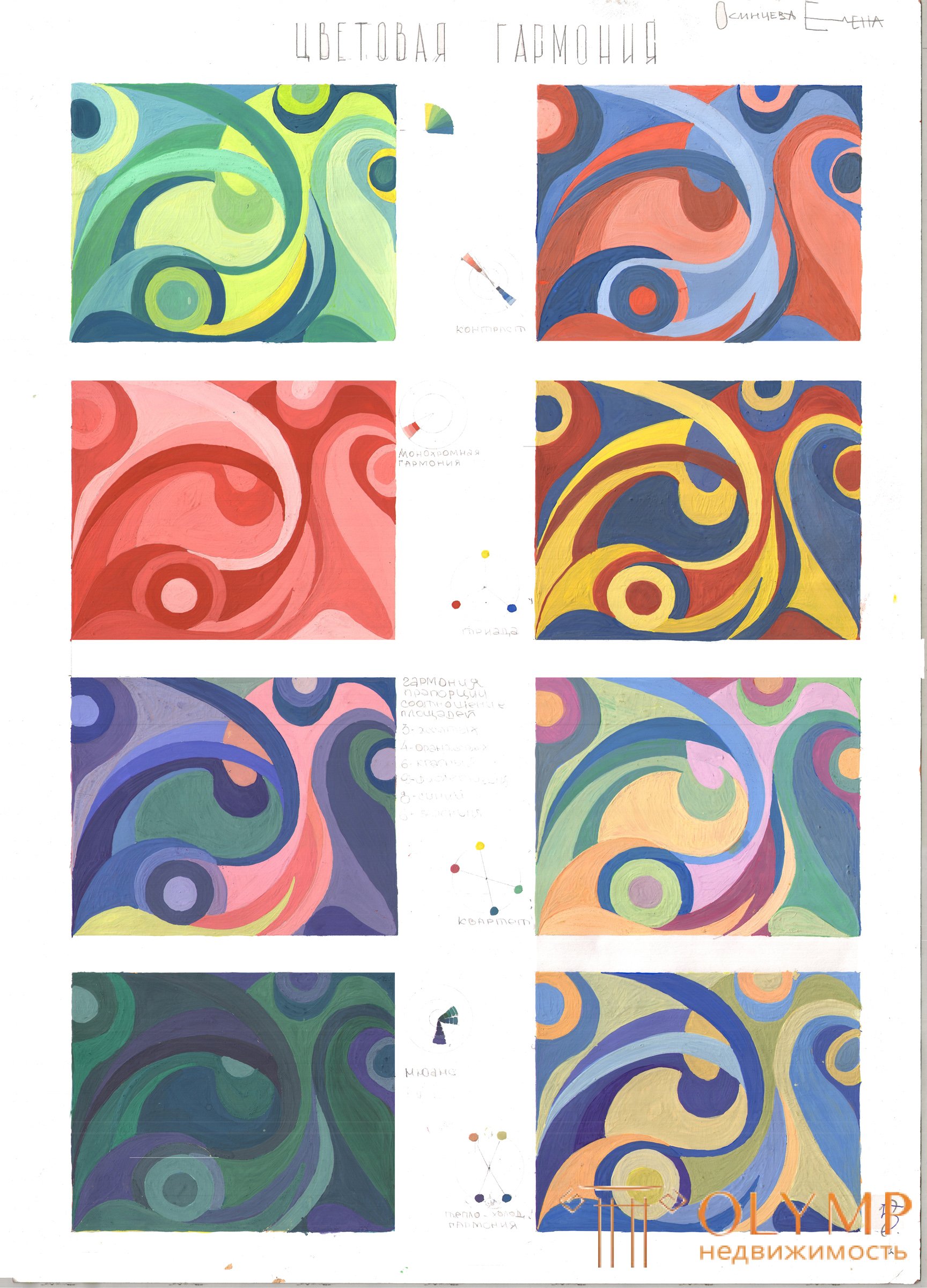
The same experience can be carried out with other geometric shapes. Further development of this topic can be found in the section on the harmony of color consonances.


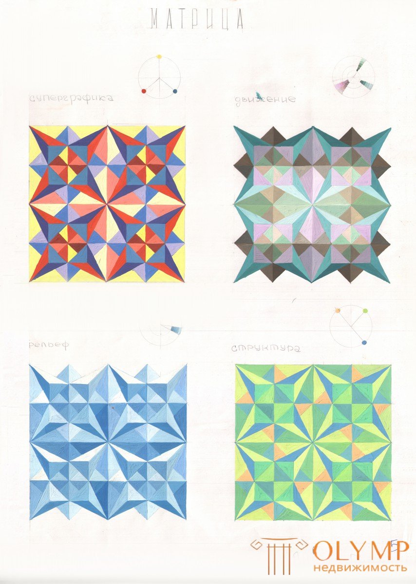
super graphics, motion, structure, relief
Что бы оставить комментарий войдите
Комментарии (0)