13.1 The concept of identity, nuance and contrast
The words contrast and nuance are not specific architectural terms, they are generally significant and are used when it is necessary to determine the degree of difference between any objects or phenomena. The initial state in the counting of differences is the state of complete similarity, coincidence, sameness, identity, that is, identities - the simplest type of relationship. The identity of the alternating elements determines the metric regularity - the columns in the colonnade of the ancient Greek temple are identical, the intervals between them are identical. The identity of linear dimensions of a spatial form (square, circle, cube, ball) is an expression of its internal equilibrium, static, immobility.
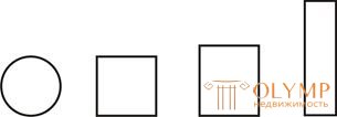
Figure 49 - Identity of elements
Nuance - a relationship in which the similarity is more pronounced than the difference. Signs of similarity bind rhythmic range.
Contrast is a relation in which the difference of homogeneous properties prevails. A number of contrasting elements are combined by the opposite of signs.
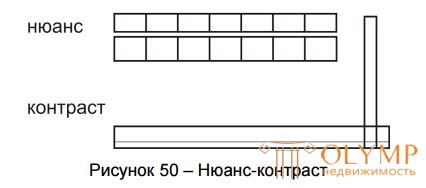
Figure 50 - Nuance-Contrast
The contrast of measurements of the spatial form gives rise to its dynamism, the sensation of movement towards the prevailing magnitude. Like all other means of organizing a spatial form, identity, nuance and contrast cannot be arbitrarily chosen relationships. Their choice is determined by the spatial structure arising on the basis of the function and the design possibilities; they serve as a means of expressing the content of the composition.
Contrasts of the elements high and low, developed horizontally and vertically, flat and volume, large and small, can be referred to the common types of contrast juxtaposition of spatial forms. Contrast may be such properties as closure and openness, heaviness and lightness. Contrast colors and textures (smooth - rough) complement the comparison of volumes.
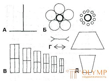
Figure 51 - Optical illusions: A - the illusion of perpendicular lines - equal segments seem to be unequal; B - the illusion of contrast - equal circles seem to be unequal; B - the illusion of the nuance series masking the real relations of extreme values; D - the illusion of oncoming and diverging angles - equal segments seem unequal. D - equal upper sides of the trapezium seem unequal.
,
;
A : The vertical line divides the second in half. The horizontal line seems to be much shorter. Error in the assessment is usually about 25%. The vertical component of the contrast pair (vertical - horizontal) seems to be significantly increased. Illusion arises when observing works of architecture.
B : A geometrical figure, inscribed in a larger figure, seems to be much smaller than a size equal to it, but adjacent to smaller ones. This illusion helps to emphasize the overall dimensions of monumental structures when comparing them with a subtle pattern of details. Large space seems even more extensive if it is revealed immediately after the small and crowded.
Q : The nuances in the relationship between the elements of the series cause a different illusion. The actual difference in the values of the extreme elements of the series seems completely implausible; This clearly shows a series of decreasing rectangles in the drawing. The smaller one is equal in area to a quarter of the first, the largest, and has twice the height. A visual sensation refutes this truth. The height of the small rectangle is at least 20% greater than the actual.
Purposeful application of contrast and nuance helps to reveal the main thing in the composition, to develop its dynamics in the right direction. With their help, it is possible to correct to some extent the forcedly occurring unfavorable ratios of parts.
Identity , nuance and contrast , as well as scale, are categories of architectural composition and at the same time its means by which many compositional tasks are solved.
Similarities and differences in comparing simple geometric bodies
Identity, nuance and contrast as a compositional means play a formative role in creating a holistic architectural composition, determining the measure of the relationship between other means of composition.
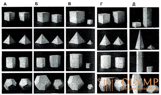
Figure 52 - Similarities and differences in the comparison of simple geometric bodies:
A - identity - complete similarity of geometric bodies; B - nuance difference of geometric bodies in magnitude; B is a contrasting geometric difference.
tel size; G - nuance difference of geometric bodies in shape; D - a contrasting difference in geometric bodies in shape.
13.2 Identity as the principle of complete similarity of elements
The principle of identity is the most ancient law of interaction of elements from which habitable structures were ever built. The blocks of stone are identical in shape and size, as well as bricks. Large surfaces of modern buildings consist of identical elements: windows, panels. The principle of identity is widely used in modern mass construction: the prefabricated elements are repeated, the spaces of large city-planning formations are repeated. On the principle of identity based the construction of metric and some rhythmic series. The principle of identity is the basis of modular systems.
The identity in the construction of the composition plays only a certain role and has certain limited capabilities. Identical relations are capable of expressing only a certain mass character, multitude, or extent. Therefore, forms built on the basis of recurring elements, as a rule, contain additions and inclusions that differ from the basic background or regularity (introducing some feature or emphasis into the series in addition to the basic regularity).
13.3 Nuance as a ratio of close states of properties
Nuanced differences serve as the basis for building rhythmic rows, if these differences increase or decrease evenly.
Nuance as a quantitative relation of values serves as a measure in the formation of a holistic architectural form and participates in the complex joint “work” of all the means of architectural composition that form all the states of the form: lightness and gravity, static and dynamic, massive and spatial.
At the same time, in some cases it is necessary to treat nuanced differences very carefully. For example, the deviation of a vertical line from a strict vertical or horizontal - from the horizontal to a small extent, even in a very small one, is acutely perceived by the eye as a kind of confusion and is associated with the leading role of the vertical and horizontal as directions determining the orientation of a person in space. In the frontal compositions and facades of buildings, the magnitude ratios of the planes and apertures should be read clearly, leaving no doubt in their real meaning. Otherwise, the nuanced differences will cause the deviations of the facade elements from the expected position to be perceived as an inaccuracy admitted by the author of the project.
Nuanced differences are not a sufficient basis for building a holistic composition, but this is possible if the goal is to create a calm balanced form that is devoid, however, of almost any dynamism, but nonetheless harmonious.
The interaction of nuance relationships with contrasting is found in architectural composition much more often. As for the nuances, architectural color is an extremely wide field of application.
Contrast is like rhythm. The elements located abruptly differing from each other (in area, color, light and shade, shape, etc.) are similar to rhythmic alternation, devoid of any accuracy. The contrast gives the composition an expressiveness, with its help it is easy to single out the main elements, to increase the range of the dynamics of the composition. But too sharp a contrast is the danger to violate the integrity of the composition, so an alternative means is a nuance.
The contrast contains a clear contrast, and the nuance is a barely noticeable transition, shade.
Nuance means subtle, insignificant differences of objects for any properties.
 | |
| Contrast. |
 | |
| Nuance. |
The nuance of the form is also important. Thanks to him, we have a huge range of items, we can choose among them.
Uncomplicated and symmetrical forms "read" much faster than others. The most difficult perceived fantastic, sophisticated forms, devoid of obvious associations. They attract attention, but can cause an unpredictable attitude.
It is established that the symbolism of the reflection of the form corresponds to the real sensations. For example, the zigzag line "^" conveys the impression of a sharp change, concentration of force, rapid release of energy. So all nations graphically depict lightning. Unbalanced forms cause feelings of discomfort, a person seeks to finish and complete the incomplete forms in his mind.
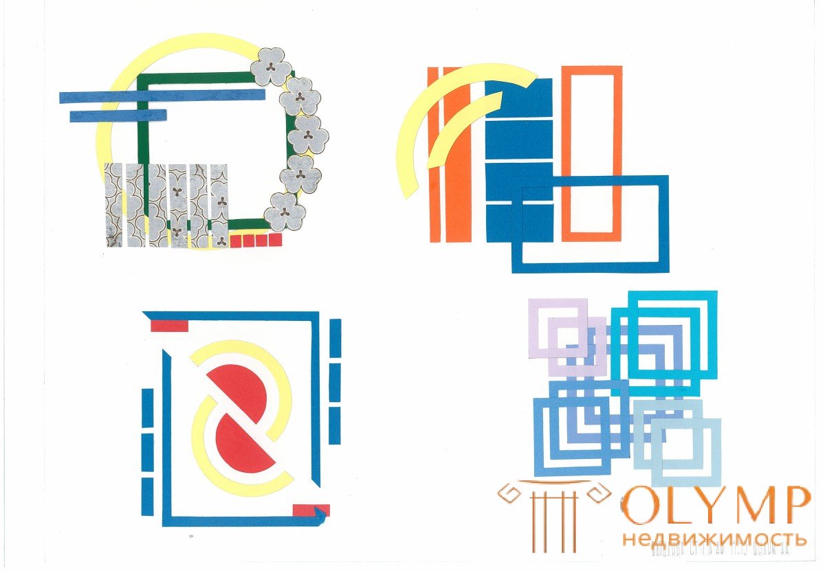
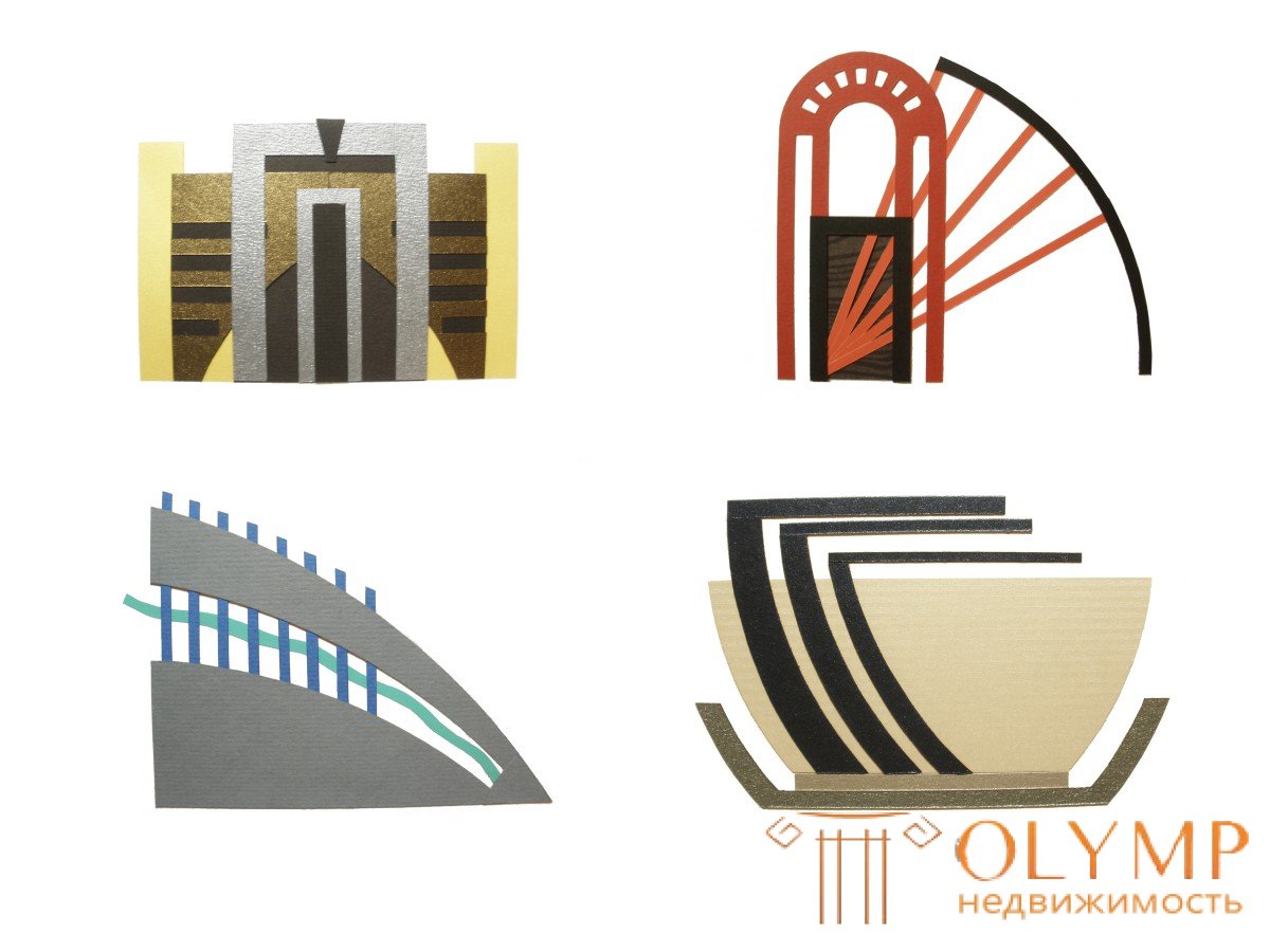
Что бы оставить комментарий войдите
Комментарии (0)