The variety of visual perceptions is based on the fact that the world around us is illuminated by streams of light, varying in strength and spectral composition - color. Since ancient times, color was a powerful means of emotional impact, but was used mostly intuitively.
It was only after Newton discovered the solar spectrum (1672) and then the development of scientific research in the field of the theory of light that a young science appeared - color science.
The absorption of light by an object can be selective, when the energy of waves of different lengths is absorbed differently, and non-selective, when waves of light of any lengths are absorbed equally. All colors of the spectrum absorb light selectively and are called chromatic (color) in contrast to white, black and transition colors - gray, which are absent in the spectrum and constitute a special group of achromatic colors.
Achromatic colors have indiscriminate absorption and differ only in lightness, which can be understood as a relative brightness, characterizing it by the reflection coefficient. There are many of these shades - the human eye can distinguish between them up to six hundred - from the darkest to the lightest. Thus, a wall whitewashed with chalk seems lighter than the details of pure alabaster or white marble located on it. Zinc, lead and titanium whiten is still brighter, but even they seem grayish against the background of fresh snow. Powders of magnesium oxide or barium sulphate are sharply distinguished by whiteness even on snow. In the same way, one can observe significant gradations of black and, especially, gray colors.
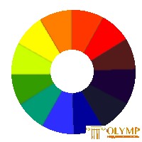
 Chromatic colors differ not only in lightness, but also in color (in color tone). The natural scale of color tones is a spectrum in which a constant sequence of colors is preserved. Mixing the extreme spectral colors - red and purple, receive intermediate colors between them, which are absent in the spectrum of purple colors. Spectral colors along with purples can be positioned around the circumference, resulting in a color circle in which the human eye can distinguish up to one hundred eighty shades (Fig. 78).

Figure 78 - The colors of the solar spectrum, arranged by I. Newton
Surfaces covered with small colored strokes, dots, stripes appear monotonous at some distance, all the different colors merge into one common color. The same happens with the rapid rotation of the disk, painted with different colors, due to the fact that different color irritations overlap each other in the same sensitive elements of the eye. Therefore, such a mixture of colors is called optical.
For any chromatic color, you can pick up a second one, which, when optically mixed, will produce an achromatic color. So, ultramarine is added to lemon yellow, green is added to red, etc. Such pairs of chromatic colors are called mutually complementary.
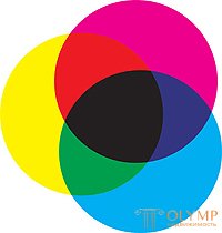
When mixing non-complementary colors, intermediate colors between them are obtained: green in various shades from yellow and blue; purple and purple - from red and blue, etc. (fig. 79).
Considering the effect of light in an abstract way when observing the color wheel or based on experience, all colors can be conventionally divided into
two parts so that one of them

Figure 79 - Subtractive color mixing
included red, yellow and yellow-green, which are perceived as warm, in association with the color of fire, sun, red-hot objects, and the other - cold - from purple to blue and green, which are associated with ideas about the color of ice, water, metals and t. n.
In the same way, the color wheel can be conditionally divided into colors that excite and soothe, create the illusion of retreating and projecting surfaces, reduce and increase the true dimensions of objects, and also cause sensations of heaviness or lightness of objects painted in them. The color of the rooms in red and other warm saturated colors gives the impression of being crowded, since the warmth and saturation hide the space, and the color of the room in blue and other light cold colors, on the contrary, creates a feeling of spaciousness.
In order to visually reduce a room that is too long and narrow, the end walls should be painted in warm colors and illuminated less intensely than the side walls. The ceiling, lit moderately and painted in dark warm colors, visually lowers the height of the room. Ceilings and load-bearing structures painted in light colors seem lighter, while those painted in darker colors than the basic color tone give the impression of heavier ones (Fig. 80).

Figure 80 - Regulation of visual impressions in the interior space using “deleting” and “approximating colors”
Conscious use of lighting and color in the architectural composition becomes an active means of artistic expression of the organized space of the artificial environment.
A distinction is made between the color of light falling on the spatial form or the chromatic structure of the visible spectrum, and the color of the body, that is, its own color of the form.
The visible spectrum consists of a warm gamut (yellow - orange - red colors and intermediate states) and from a cold gamut (green - blue - violet colors and intermediate states). The original primary colors are three colors: red, yellow and blue. Mixed in pairs, they give the rest of the spectral colors. The sum of the three original colors is white (achromatic) color.
Color can be classified into categories such as: color tone, saturation and brightness.
Color should be considered as an additional component that can reveal, but can also visually deform, destroy the volumetric-spatial form. An example of the destruction of the form can serve as military camouflage.
Color is one of the means of construction and, especially, the identification of form. Using the features of color, you can compensate for the shortcomings of the form or emphasize, strengthen the characteristics. This especially applies to spatial compositions. Combining cold and warm colors, saturation and amount of color, you can illusoryly expand the space, create a feeling of spaciousness or, on the contrary, as if to bring closer the volumes that organize the space to the viewer.

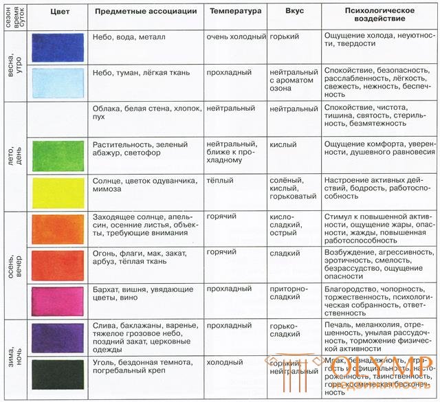
Figure 81 - Associative psychological effect of color
19.2 Shape, color and texture in architectural composition
For the perception of the shape, the direction of the incident light is important. With a changing direction of illumination, the same form produces a different impression; for example, the same eaves of a building, depending on the time of day, year, and geographic location of an object, can create shadows of different depths.
The relief of objects, their external three-dimensional shape are perceived by the gradations of the transition from light to shade, called chiaroscuro. The richest transitions from light to shadow on light objects. The perception of form enriches reflexes - gradations of light and shade, appearing as a result of illuminating objects with reflected light. The brightness and color of the reflexes depend on the illumination and the properties of the reflecting surface.
If the light is scattered and there are no shadows, the relief of objects is lost, their shape seems to be more flat. The perception of the form is also hampered with too intensive one-sided lighting, which gives a sharp contrast of light and shadow with poorly visible shades of light and shade. Light directed from behind an object hides plasticity of surfaces and actively reveals the silhouette of the structure.
Of great importance in the perception of architectural forms are the color and character of the surface. The rich possibilities include the textures of modern materials. The plasticity of monolithic concrete is often reflected in a kind of “pattern” of formwork boards, leaving an imprint on its surface. The texture, texture properties and the natural color of the material have an objective quality of the architectural form and are an active means of artistic expression. For example, the contrast of light marble with stone or darker material in the buildings gives the first extraordinary lightness and festivity.
Along with the use of natural materials for which color is an objective property, various types of dyes and artificial materials are especially widely used in architecture, the color and color of which do not belong to a constructive material and have a certain independence in relation to the architectural form. The color range of dyes is becoming more diverse and becoming a powerful means of enhancing the emotional expressiveness of architecture, but with arbitrary use it can destroy the compositional concept. The dissonant, non-harmonized coloring of buildings can turn the compositional concept into chaos.
The architecture of different countries have developed their own methods of color solutions. Thus, in northern countries, where the sun is low, and on cloudy days the cut-off modeling of the form may be practically absent, the contrasting saturated coloring of buildings is more often used, the main divisions and plastic details are emphasized by means of color. In the south, on the contrary - the bright sun creates deep shadows even with slight protrusions of the form - here monochrome and less contrasting color gamuts are more appropriate.
The techniques of color solutions, based on the principle of unity of the structure and color of the structure, are aimed at identifying the tectonics and scale of the architectural form. Color as it separates the color of various structural elements. The prevailing local coloring of the wall field, where the functional accents can become color accents - window covers, balconies, loggias, entrances - unites the composition. Color can develop a rhythmic system, make additional rhythms that develop a general pattern.
Separating the basement or the eaves, you can emphasize the length of buildings, you can enhance the perception of verticality, painting the frameworks, barriers of balconies, balconies or stairwells accordingly.
The color polychromy of an architectural ensemble should reveal the organization of its space, emphasizing the main and unifying minor elements. The subordination of color and form is the key to enhancing the emotional impact of architecture.
The functions of color in the architectural composition are very diverse: it can isolate or neutralize individual elements, combine them into a single whole, or, conversely, dismember them. The color can reveal the architectonics of the structure, create additional rhythms, make a decorative accent.
Color not only helps to identify the ratio of volumes, but also facilitates orientation in space. The use of retreating and protruding colors, which increase and reduce space, allows you to visually select or move away individual volumes, reveal or change the scale.
Что бы оставить комментарий войдите
Комментарии (0)